
Coffee is a beverage that puts one to sleep when not drank. – Alphonse Allais
While gulping that lazy morning coffee or enjoying the much needed late night coffee, we cannot help but think of the very recognizable logo of World famous Starbucks. Today, we are going to discuss the logo design of Starbuck and its journey of evolution till now.
Many businesses around the world, uses mascot in their logo or other promotional elements, but giving the honor to a two-tailed mermaid is something no one could imagine, no one but Starbucks. The mermaid or siren is a mythological creature that said to lure sailors with their magical voice. Similarly, coffee seems to compel people to have it over and over again and cannot be replaced with any other beverage in the world.
The logo of the Starbucks has few revisions till now. Let’s take a walk through the journey of its logo revision.

1971- The original version was brown in color with words ‘fresh roasted coffee’ in it. It featured a bare-chested, twin-tailed mermaid inside a circular form that remained unchanged in its upgraded version as well.

1987- This logo was later revised by painting the logo in green. This logo design also features the word ‘coffee’ with 2 stars in it, highlighting coffee as its prime product. The mermaid in this logo version has her hair spread over her chest.

1992- The logo was revised only minutely. The navel of the mermaid is no longer visible in this close-up view and the color was switched to a different shade of green. This green shade looks more resembling to nature and implied that Starbucks uses fresh, natural ingredients.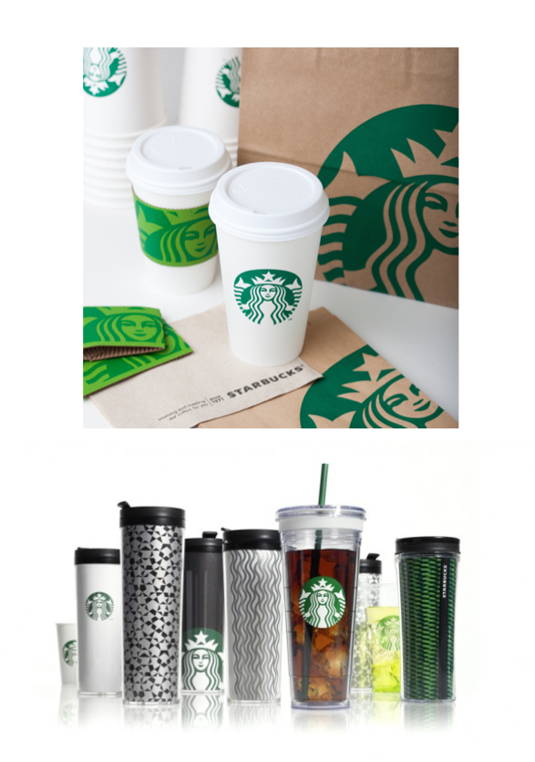
2011- This final logo revision is being used by Starbucks till now. It removed all the words and the starts from the logo altogether. This is now a brandmark logo that speaks for itself. It comprises of a more close-up view of the mermaid, just painted in a green and white scheme.
Perhaps this is the ultimate logo of Starbucks that we are going to admire for many years to come now, or perhaps, soon we will witness yet another phase of its evolution. Either way, it gives every business to consider one question ‘Shall I consider revamping my business logo as well?’
Of course, it is your call to make, but keep the golden world in mind- ‘Change is the only constant.’ A revamped logo design offers many benefits to the business and spice things up for it.

