
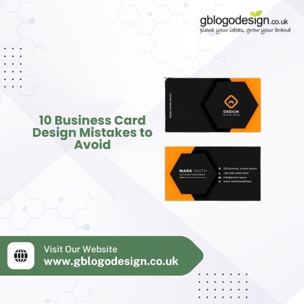
Your business card is often the first physical touchpoint a potential client has with your brand. In a competitive UK market, a poorly designed card can undo months of hard marketing work in seconds. Whether you’re a startup or an established company, avoiding these common mistakes will help your card leave the right impression.
- Cluttered Layouts
Cramming too much text, icons, and colours onto one small card overwhelms the reader. Stick to the essentials: name, role, company, contact details, and a clean logo.
- Ignoring Brand Consistency
Your business card should reflect the same colours, fonts, and logo style as your website and other marketing materials. Inconsistent branding confuses customers and weakens recognition.
- Poor Quality Logo
A blurry, pixelated, or amateur logo instantly damages credibility. Investing in professional Business Logo Design London ensures your card looks sharp both in print and digitally.
- Hard-to-Read Fonts
Decorative or overly stylised fonts might look creative, but if clients can’t read your phone number or email, the card fails its basic purpose. Prioritise legibility over flair.
- Low Contrast Colour Choices
Light grey text on a white background or similar low-contrast combinations make cards difficult to read, especially in dim lighting. Choose colour pairings that are bold and clear.
- Skipping Bleed and Margins
Text or images cut off at the edges look unprofessional and are a common printing error. Always design with proper bleed and safe margins to avoid awkward trims.
- Using Outdated Contact Information
It sounds obvious, but many businesses print cards with old phone numbers, email addresses, or social handles. Double-check every detail before ordering a large batch.
- One-Sided Design
The back of your card is valuable real estate. Leaving it blank wastes an opportunity to add a tagline, QR code, or social media handles that support your brand story.
- Cheap Paper Stock
Even the best design suffers on flimsy, low-quality card stock. A thicker, textured, or matte-finish card communicates professionalism and quality before a word is read.
- DIY Design Without Expert Input
Free templates and DIY tools might save money upfront, but they rarely produce a distinctive, memorable result. Partnering with experienced designers ensures your card stands out for the right reasons.
Final Thoughts
Your business card is a small canvas with a big job: making people remember you. Avoiding these design pitfalls will help your brand look polished, credible, and professional from the very first handshake.
At GB Logo Design, we specialise in bespoke branding solutions, including business card design and Business Logo Design London, tailored to help your business make a lasting impression. Get in touch today to create a business card that truly represents your brand.