The Ultimate Guide to the Best Logo Design Trends for 2026
In 2026, logos continue to play a crucial role in shaping how people recognize your brand. A good quality logo design makes your brand identity stronger. The logo of any brand should reflect its brand potential, purpose, and trustworthiness. As consumer expectations evolve and technology reshapes digital experiences, logo design trends naturally change. Staying updated helps brands remain visually relevant and competitive. Although, new look makes the brand personality versatile for their audience. In this blog, the best Logo Design services in the UK will introduce some new edge logo designs that will define the branding success in 2026.
Minimalism with a Bold Twist
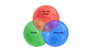
Minimalist logos are not fading away, but they are becoming more expressive. In 2026, simplicity is paired with bold typography, high contrast colors, and striking shapes. Brands are choosing fewer elements while making stronger visual statements. This approach ensures logos remain clean yet memorable across websites, mobile apps, and social media platforms. Bold minimalism works because it delivers clarity, modern appeal, and instant recognition in crowded digital spaces.
Dynamic and Adaptive Logos
Static logos are being replaced by flexible designs that adapt to different platforms and contexts. Dynamic logos can change size, color, or form while maintaining a consistent identity. Animated elements and responsive layouts are especially popular among digital-first brands and mobile apps. This trend allows businesses to stay visually engaging without losing brand consistency. Adaptive logos reflect the fast-paced, interactive nature of modern digital environments. If you like to create a minimal logo with a stronger impact, you can contact the best Logo Design company in London, and make your brand value more strong and competitive.
Handcrafted and Human-Centered Designs
As audiences seek authenticity, handcrafted logo designs are gaining attention. Hand-drawn details, organic lines, and slightly imperfect shapes bring warmth and personality to branding. These logos feel more human and relatable, making them ideal for startups, local businesses, and creative brands. Human-centered designs help build emotional connections and trust, especially in an era where consumers value transparency and genuine brand stories.
Experimental Typography as a Visual Focus
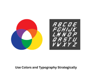
Typography is becoming the hero of logo design in 2026. Brands are experimenting with custom fonts, altered letterforms, and creative spacing to stand out. Designers are using negative space and unique typography layouts to create logos that feel expressive and bold. When done thoughtfully, typography-driven logos strengthen brand personality and communicate uniqueness without depend on additional symbols or icons. For optimal typography that perfectly aligns with your logo, consider reaching out to the top Logo Design company in the UK to make your logo’s typography stand out.
In a Nutshell
While trends offer inspiration, the best logo choice always aligns with a brand’s identity and long-term goals. Avoid chasing every trend and focus on designs that offer flexibility and consistency. A thoughtful logo comes with a creative mindset, market strategies, and consumers’ thoughts about your previous brand logo. Moreover, a fancy logo makes your brand personality more eye-catching and trendy. So, using that kind of logo in 2026 is the best choice to grow your brand. To create the best logo for your brand, you can contact GB Logo Design, the best Professional Logo Design services in the UK, and make your brand value higher in people’s eyes.
Also Read: This New Year, Rebrand Your Business With GB Logo Design’s Tips & Tricks