Why Every Successful Business Starts With a Powerful Logo
A logo is often the very first thing people notice about a brand. Before someone reads a tagline, explores a website, or interacts with a product, the logo quietly introduces the business. A well-crafted logo builds curiosity and sets the tone for what customers can expect. That’s why the world’s biggest brands, from tech giants to small boutiques, invest so much time and creativity into designing the perfect mark. Moreover, a logo is the first visual people see, so making it attractive and meaningful is very important. A logo should reflect the brand workflow and the vision. In this blog, the best Logo Design company in the UK will tell you how a thoughtful logo design can make a successful business.

What Makes a Logo ‘Powerful’?
A powerful logo is more than a pretty graphic. It carries the brand’s essence through a simple, memorable, and versatile design. The strongest logos are clean enough to be recognized instantly yet meaningful enough to reflect the brand’s purpose. Elements like color, typography, and symbols play a huge role in shaping how a logo feels. A good logo doesn’t just decorate; it communicates, represents, and connects with the audience at a deeper level.

A Logo Creates Instant Brand Recognition
One of the biggest advantages of having a strong logo is recognition. When customers see the same symbol consistently across packaging, websites, ads, and products, the brand sticks in their minds. Think of the big brands’ logos, like Nike’s big slash, Apple’s bitten logo, and McDonald’s golden M sign. These logos are understood globally even without a single word. The more recognizable a logo is, the easier it becomes for customers to trust, remember, and choose the brand again. A strong identity is built through thoughtful creation. From clothing brands to smartphone brands, everyone stands out with a meaningful, attractive logo. If you want to create an everlasting logo for your brand, contact the best Business Logo Design services in the UK to build your brand reputation.
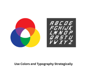
Logos Communicate Your Brand Values at a Glance
Your logo quietly signals what your business values. A minimal design can suggest sophistication or exclusivity, while bold, vibrant images attract energetic, youth-oriented audiences. Color choices evoke emotion: blue inspires trust, red energizes, and green implies growth or eco-friendliness. An intentional logo communicates your identity and mission before customers ever use your products or services.

A Strong Logo Builds Trust and Professionalism
People naturally trust businesses with a polished, cohesive image. A professional logo conveys a sense of established, trustworthy, and quality-driven commitment to your business. When you display a unified visual identity across social media, websites, packaging, and marketing materials, it weakens your trustworthiness. Customers are much more likely to engage with a brand that appears visually appealing. If you want packaging that compels customers to choose your product, visit the top Packaging Design company in the UK for standout packaging solutions.
Conclusion
A powerful logo is not just a piece of art; it’s a strategic investment that shapes how the world sees your business. By prioritizing a professional and thoughtful logo, you lay the foundation for long-term success, stronger recognition, and a trustworthy brand presence. Moreover, the strong branding and good portfolio help you to stand out in the global market as well. So if you want to create an impactful logo to showcase your brand identity, then come to GB Logo Design, the best Professional Logo Design company in the UK, and make your business recognized on the global platform.
Also Read: What Makes a Great Logo for Product Brands? Key Design Elements to Focus On